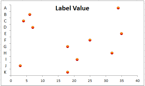
How to create dot plot in Excel?
A dot plot is a simple and effective way to visualize data points along a single axis. Although Excel doesn’t have a built-in dot plot chart type, you can easily create one using scatter plots or stacked bar charts. This guide will walk you through creating a dot plot in Excel with step-by-step instructions and tips for customization.
Create dot plot in Excel (many steps)
Create dot plot in Excel with Kutools for Excel (3 steps)
Create dot plot in Excel
To create a dot plot, you need a formula to calculate each data’s relative height data.
Height data provides the vertical coordinates for Y axis.
1. Select the first cell and type" Height" into the column next to your data, here, I select C1. See screenshot:

2. Then in C2, type this formula =(ROWS($A$2:$A$12)-ROW()+ROW($A$2:$A$12)-0.5)/ROWS($A$2:$A$12), press "Enter" key and drag autofill handle to the range you need to apply this formula. See screenshot:

3. Select the first and second columns (Label Column and Value Column) data, and click" Insert" >" Bar" > "Clustered Bar". See screenshot:

4. Select the Legend in the chart, and press "Delete" key to delete it. See screenshots:
 |
 |
In Excel 2013, the legend is not added into the chart by default. If the legend exists, please delete it.
5. Then select the second and third column (Value Column and Height Column) data, and right click to select" Copy" from the context menu. See screenshot:

6. Then click at the chart, and click "Home" > "Paste" > "Paste Special". See screenshot:

7. Then in the popped out "Paste Special" dialog, check "New series" option in "Add cell as" section, check "Columns" in" Values (Y)""in" section, and both check "Series Names in First Row" and "Categories (X labels) in First Column" checked boxes. See screenshot:

8. Then click "OK", you can see the bar chart become as follow:

9. Right click at first series (the blue one), and select "Format Data Series" from the context menu. See screenshot:

10. In the "Series Options" section, check "Secondary Axis". See screenshot:

In Excel 2013, check "Secondary Axis" under "Series Option" section in the "Format Data Series" pane.
11. Close the dialog and then go on to select the blue series, and click "Layout" >" Axes" > "Secondary Vertical Axis" >" Show Default Axis". See screenshot:

In Excel 2013, click "DESIGN" > "Add chart Element" > "Axes" > "Secondary Vertical".
Then you can see the bar shown as below:

12. Click on the red series, and go to "Design" tab, and select "Change Chart Type". See screenshot:

13. In the "Change Chart Type" dialog, click "X Y (Scatter)" section, and click "Scatter with only markers". See screenshot:

In Excel 2013, you need to click "All Charts" tab in the "Change Chart Type" dialog, and then click at the arrow of the "Height" series name, and select "Scatter" from the list. See screenshot:

15. Click "OK". Now you need to change the markers to circles. Right click at the red markers, and select "Format Data Series". See screenshot:

16. In "Format Data Series" dialog, click" Marker Options" tab, and check "Built-in" option, then select circle from the list of "Type". See screenshot:

In Excel 2013, you do not need to change the marker to circle.
17. Close the dialog. Then right click at the primary Y axis (the left one), and select "Format Axis" from the context menu. See screenshot:

18. Then in the" Format Axis" dialog, go to the "Axis Options" section, check the "Fixed" option behind the "Minimum", and entering "0" in the following text box; check the "Fixed" option behind the "Maximum", and enter "1" in the following text box. Then check "Axis value" and type "0" into its text box in the "Horizontal axis crosses" section. Then close the dialog.

In Excel 2013, you just need to directly type" 0" and "1" in the "Minimum" and "Maximum" text boxes, and check" Axis value" with "0" typed in the" Format Axis" pane.

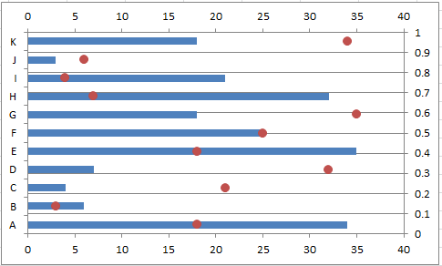
Now the chart shown as below:

19. Then right click at the primary X axis (the bottom one) and select "Format Axis".

20. In the "Format Axis" dialog o"r Format Axis" pane, check "Maximum axis value" in the "Vertical axis crosses" section, then close the dialog.


21. Right click at secondary X axis (the top one) and select "Format Axis".

22. Then in the" Format Axis" dialog or" Format Axis" pane, check "Automatic" option in the "Vertical axis crosses" section. Then close the dialog.
 |
 |
23. Right click at the primary Y axis (the right one) and select" Format Axis", then in the "Format Axis" dialog, select" None" from the list of "Axis labels". Then close the dialog.

In Excel 2013, you need to click" LABELS" to expand its section, and select "None" from the" Label position" list.

24. As well, right click at the secondary X axis (the top one) and select" Format Axis", then in the "Format Axis" dialog, select "None" from the list of" Axis labels". Then close the dialog. Then you can see the chart show as below screenshot:

25. Right click at Y axis and select" Format Axis", then in the popping "Format Axis" dialog or "Format Axis" pane, check "Categories in reverse order" and" Automatic" options. See screenshot:
 |
 |
 |
26. Right click at the bar and select "Format Data Series". Then in the dialog, click "Fill" tab and check "No fill" option.
 |
 |
In Excel 2013, click" Fill & Line" > "Fill" > "No fill" in the" Format Data Series" pane. See screenshot:

27. Close the dialog, now a simple dot plot is created.

You can format it as you like.

Create dot plot in Excel with Kutools for Excel (3 steps)
Creating a dot plot manually in Excel can be time-consuming and complex, fortunately, Kutools for Excel simplifies the process with its user-friendly tool. With its "Dot Chart" feature, you can generate a professional-looking dot plot chart to visualize your data clearly and effectively with just a few clicks.
After installing Kutools for Excel, please do with the following steps:
- Click "Kutools" > "Charts" > "Category Comparison" > "Dot Chart", see screenshot:

- In the "Dot Chart" dialog box, select the "Axis Labels" and "Series Values" data ranges separately, see screenshot:

- Then, click OK button, the dot chart is created at once, see screenshot:


In conclusion, creating a dot plot in Excel can be done efficiently using various methods. Whether you choose to create a dot plot using Excel’s built-in features or Kutools for Excel, the process can be quick and straightforward. By selecting the method that best suits your needs and data complexity, you can enhance your data visualization and make your analysis more impactful. If you're interested in exploring more Excel tips and tricks, our website offers thousands of tutorials.
Relative Articles:
Best Office Productivity Tools
Supercharge Your Excel Skills with Kutools for Excel, and Experience Efficiency Like Never Before. Kutools for Excel Offers Over 300 Advanced Features to Boost Productivity and Save Time. Click Here to Get The Feature You Need The Most...
Office Tab Brings Tabbed interface to Office, and Make Your Work Much Easier
- Enable tabbed editing and reading in Word, Excel, PowerPoint, Publisher, Access, Visio and Project.
- Open and create multiple documents in new tabs of the same window, rather than in new windows.
- Increases your productivity by 50%, and reduces hundreds of mouse clicks for you every day!
All Kutools add-ins. One installer
Kutools for Office suite bundles add-ins for Excel, Word, Outlook & PowerPoint plus Office Tab Pro, which is ideal for teams working across Office apps.
- All-in-one suite — Excel, Word, Outlook & PowerPoint add-ins + Office Tab Pro
- One installer, one license — set up in minutes (MSI-ready)
- Works better together — streamlined productivity across Office apps
- 30-day full-featured trial — no registration, no credit card
- Best value — save vs buying individual add-in